Wednesday, November 30, 2005
Tuesday, November 29, 2005
Cheesden Where?
Industry, cotton manufacture, steam engines, chimneys and tail races are all terms which tend to make the toes curl of the average architecture junkie. I have been brought up in an environment surrounded by such elements and it has been one of my principle concerns since childhood to make sense of my grim industrial and urban locale.
Most of my life I have been pained by the reality of my surroundings, but through trying to understand the history of industrialisation of my area I have at least found some acceptance and in other ways realised that the Bill Brandtesque streetscapes are a part of my identity. Through accepting some of the uglier aspects of my urban surroundings I have gained a sense of peace which has enabled me to see value in the accrington brick, the proud foundation plaques and the cast iron gutters dotted throughout my existence.
Strangely, the photography of my locale has evolved from factual to the pictorial (a little out of fashion today). The image above is taken in Heywood Lancashire.
Industrial canal Manchester UK
As a direct result of this journey I have found in my own backyard an industrial site which is (in my opinion) worthy of World Heritage Status. The Cheesden Valley, Heywood, Lancashire. What is remarkable about this valley is that along its three mile length from top to bottom we have the remains of several mills which represent the full chronology of the industrial revolution from waterpower to steam and finally electricity. I have set up a mini site and am updating it as I manage to get around and take more photo's. (I am currently engaged in transferring these pages over to my new fotofacade web site).
Cheesden Lumb Lower Mill - late C18th water powered
I have spent the last few years travelling throughout Europe photographing the urban streetscapes both historic and contemporary trying to quell my anxious zeitgeist and all along the answers were in my own back yard.
All images are copyright Andy Marshall
URBS - Urban Blogging Awards
Thanks to Gridskipper for including my blog in the 2005 Urban blogging awards nomination for world's best urban architecture blog. I'm humbled at being associated with some of the best architecture blogs in the business including A Daily Dose of Architecture and BLDBLG.
You can vote for me by sending an email to tips@gridskipper.com asking for fotofacade blog to be nominated
Monday, November 28, 2005
Lime's Fine
The above image shows a photo I took of Lime plaster at Kilpeck Herefordshire.
Around about September 2001 I was taking my post graduate diploma in Building Conservation at the College of Estate Management in Reading, UK. One of the most memorable occasions was the Lime Day at Sherborne Estate (National Trust) Gloucestershire. It was hosted by Rory Young an expert in the use of lime renders and decorative plaster. One of his projects was the new Millenium Ceiling at Wilbury Park in Wiltshire commissioned by Miranda, Countess of Iveagh.
Here are a few pictures of the day spent getting our hands dirty
It was at this event that I learn't about the remarkable qualities of Lime mortar. In most applications it is far superior to modern cement mortar (but admittedly is a little more complex to mix and apply). With regards to historic building refurbishment and renovation it is almost always that Lime Mortar is recommended for use where required. There are a number of reasons for this. Firstly, older buildings are often built without wall cavities, and for centuries have relied upon the porous qualities of stone, brick and lime render to help aid evaporation of dampness. Concrete mortars added later to historic buildings have had the effect of forming a waterproof shield which traps moisture within the walls and causes rising damp and mould growth. Lime mortar therefore, has a wicking effect. It also is softer than modern cement mortars and is able to move with time. Lime mortars used in the construction of Durham Cathedral enabled the slow evolutionary settlement of the massive piers over a period of 20 years until the structure found its own level. Lime mortar is also self leaching. Over time with the effects of rainwater travelling down its surface it is self - healing. Over time Lime mortars take on a beautiful natural ochre colour.
Now Lime Mortars are even being discussed for use in Newbuild. Ian Pritchett takes up the argument in this article
Further Links:
Interesting Research by the University of Bristol
A Conservation Engineers View on the use of Lime Mortar
ARCHIPEDIA - A is for....
Sunday, November 27, 2005
Art Nouveau
I must admit I have a love hate relationship with Art Nouveau architecture and design. I am a great fan of its antecedent the Arts and Crafts movement and I think that the stylistic exuberance might be a little too much for me at times. Nevertheless, I made a pilgramage to Rue La Fontaine, Paris, France this year to see some of the more restrained structures. The image above is a window detail by Hector Guimard. Hector Who? Guimard was also the person behind the famous art nouveau Metro stations dotted around Paris.....
Art Nouveau flourished between 1890 and 1910 and originated in Belgium. One key architect in Belgium was Victor Horta who designed the Hotel Van Eetvelde (1895) in Brussels.
It was heavily influenced by the Arts and Crafts movement in England and also by the development of wrought iron technology which was influenced by Eugene Viollet-le-Duc
Saturday, November 26, 2005
Chimney Parade
Friday, November 25, 2005
An Architectural Tour of Venice Italy 2
Thursday, November 24, 2005
An Architectural Tour of Venice Italy 1
Black and white architecture print style image of detail of the Santa Maria Della Salute votive church on the Grand Canal Venice Italy by Longhena C17th
Wednesday, November 23, 2005
BEHIND THE PHOTO....
This images is intended for editorial and advertising for conceptual use. Obviously it is a montage of several layers tied together in Photoshop. The background is of Manchester UK and was taken from the Big Wheel in The Triangle during last years Holiday Season. The laptop was taken in studio as was the model. Motion trails were added using an Andromeda plugin. Including studio time the image took about 8 hours of work.
Tuesday, November 22, 2005
Photo Archaeology
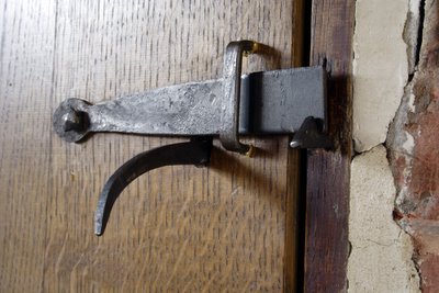
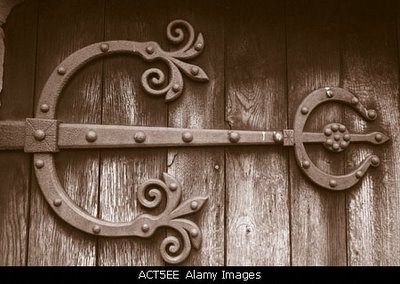
Sometimes I know that when looking at a building I focus too much on the visual drama, or the open vistas or the quality of light. Very important factors, but it is easy to forget the details when you are high on cloud nine gesticulating over that Le Corbusier stairway. I often have to remind myself to slow down and take in the details. They have a lot to say. Let's take the humble door knob for example. That completely utilitarian and functional piece of door furniture can have as much to say about a building, its architect, and its patrons as the more high grade fixtures and fittings. There is a simple beauty about the latch in my photo above which marries form with function. It looks elegant and yet informs as to the possible status of the door.
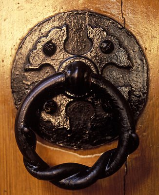
Door furniture can also dilineate spaces in terms of hierarchy. In my local church the porch interior doors have simple clasp fixtures whereas the chancel has the fixture in the photo above (Arts and Crafts by Edgar Wood 1901). As one progresses through the various spaces of the church the door furniture responds to the spiritual hierarchy of the building and is an inherent indicator as to what people thought of the different spaces when the building was built. This is important because a historic buildings original function might be blurred over time. Small details such as door furniture or a particular type of moulding can reveal a lot about the originators. It is particularly useful as an architectural photographer to have this background knowledge because it informs my photography with added understanding and value. One of my greatest pleasures is to photograph a building that has been subject to much re-use over time and with the aid of the lens - strip back the different layers of understanding. I suppose this is a sort of Photo Archaeology!
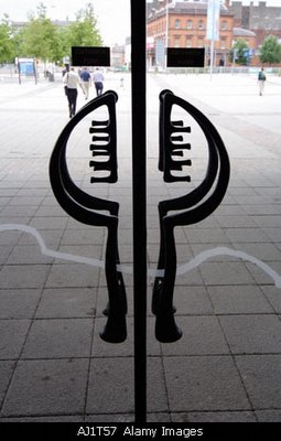
The door handles above are on the public entrance to the Millenium Building in Cardiff. They have probably been commissioned by an artist? What does it say about the status of the building? Would it be suitable to use such door handles on the toilet doors? Hierarchy plays such an important role. Sometimes the hierarchy or status of a room changes over time and the door fixtures tell you this.
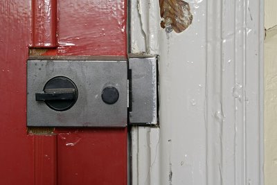
The door above used to have a rounded brass knob with a classical styling. Now a utilitarian latch type fixture has been added. It has been cut into the existing door moulding. The respect has gone for the overall appearance of the stylistic detailing. Somehow over time the function of this room has changed to something more utilitarian.
The above image was taken at Kilpeck, Herefordshire UK and is the entrance to the Church. So the next time you open a door take your time and take a considered look into the minds of the people that placed it there.
Monday, November 21, 2005
Sheffield
I sold this photo last week on my stock site. Sheffield is in the north of England and was centre of the steel industry up until the end of the C20th. What is remarkable about Sheffield is that it has single handedly re-invented itself with the regeneration of an urban space outside the existing Town Hall. The space consists of the award winning Peace Gardens (this shot is taken from there) and the Winter Garden (large glass structure in background). The Winter Garden is apparently one of the largest inner city glass structures in Europe.
You can see my images of this area here
To see a virtual 360 deg image of the Winter Garden go here
To see a virtual 360 deg image of the Peace Garden go here
Sunday, November 20, 2005
Qualities of Architectural Space
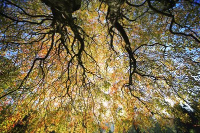
This photo (click on the image to see a larger pic) was taken on Saturday in The Museum Gardens, York, UK. I found myself being drawn to the centre of the tree, beneath its canopy and wondered what were the constituents of such magnetic qualities?
The answer is that the tree (especially a tree such as this) has the qualities of space and enclosure that we create in our homes and our workplaces. Here is a setof 'keywords' which come to mind when looking at the image:-
'enclosure, warmth, light, translucency, ambience, colour, safety, security, cover, texture, volume, scale, tone, organic, symmetry, asymmetry, growth, arterial, aspirational, hue, saturation, luminescence, permeability, porous, boundary, border, vista, etc'
Francis D.K. Ching in his remarkable book 'Architecture - Form, Space, and Order' (Wiley, New York) states that the key properties of enclosure are : shape, surface, edges, dimensions, configuration, openings. He goes on to say that the key qualities of space are: form, color, texture, pattern, sound, proportion, scale, definition, degree of enclosure, light, view.
Many times I am in an a space which is comfortable, staid, and secure but doesn't have the x factor which this image portrays. I think that what I am trying to say is that it takes much more than a design and a little research to make a great building or a fabulous space. The tree has made a perfect synergy between form and function and it is somewhere between its form and function that its energy resides.
The tree is of the hill that it resides upon, and the keywords noted above go some way into providing a sort of embryonic swatch to articulating a space which has the x factor.
Ching also states that 'The qualities of an architectural space.... are much richer than what.... diagrams are able to portray. The spatial qualities of form, proportion, scale, texture, light, and sound ultimately depend on the properties of the enclosure of a space. Our perception of these qualities is often a response to the combined effects of the properties encountered and is conditioned by culture, prior experiences, and personal interest or inclination'.
When I experience a wonderful space and I am energised by it, I try and process that feeling of awe or inspiration into a swatch of keywords which at least are pointers to why the space is successful and at most, forms the inspiration which ties into the warp and weft of my own photographic work.
Saturday, November 19, 2005
Mermaid Quay
Friday, November 18, 2005
Victorian Vermiculation
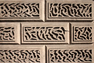
I would like to welcome the architecture students of the University of Nevada with a fine photo of Victorian Vermiculation! This particularly playful and lyrical example of rustication should keep the architectural spirits up whilst studying those long hours. Special thanks to Jeanne Brown at University of Nevada Las Vegas Libraries for listing my blog in their architecture section. Any students care to comment or suggest a contribution from the UK angle of architecture please feel free to contact me. Or maybe send some pics of the architecture you are studying?
Thursday, November 17, 2005
Nothing's Changed
On Saturday I went into town. I'm always drawn like the protagonists in Close Encounters to the big urban UFO. I always spend a disproportionate amount of time in the architecture section of the local bookshop. Anyway, whilst meandering around town I was struck by the bright and vibrant displays of fashionable people showing their stuff in the metropolis. What is it about our identity which makes us want to stick out in the crowd? When pondering about our need to be individuals in this contemporary age it struck me that this fashion craze isn't just applicable to today and not just to people. Look at the typical traditional timber framed house of the medieval period. Full of crazy designs and supernatural patterns intended to strut the wealth of the owner across the medieval stage. The design above (I took this in Stratford upon Avon, UK) could be the pattern on a Mary Quant dress? I think it is remarkable that over 500 years ago people were plagued with the same urge to peacock themselves.
Now where did I put my Calvin Kleins?
Wednesday, November 16, 2005
BEHIND THE PHOTO....
Well it's that time of week again. Every Wednesday I will be looking in depth at the technical, emotional, etc background to one of my photos. Today it is more on the emotional side. This image was taken in Venice in February 2005. It is on the Piazzetta San Marco outside the Doge's Palace. This photo was taken on the day before I got married at the Palazzo Cavelli on the Grand Canal. I found the process leading up to such an important event invigorating and the subject of my photography changed from one of abstract architecture to that of people and the associated hustle and bustle. This picture holds more than a memory for me then, with the sun slowly setting over the Zecca. It has a comfort and warmth which is calming and soothing - just what one needs on the night before the wedding. Stag Night? - just a quiet drink at Harry's Bar sufficed.
Feeling a little drained, artistic inspiration on the wane? Shoot into the sun my friend, shoot into the sun...
Tuesday, November 15, 2005
Occulus and Pediment
Occulus and segmental pediment to the remarkable Unitarian Meeting House built in 1711 in a provincial Baroque style with gauged and rubbed brickwork Bury St Edmunds Suffolk East Anglia UK
Monday, November 14, 2005
Arcam
Arcam is the Amsterdam centre of architecture (architectuurcentrum) located at Pris Hendrikkade. It was built in 2003 by R.H. van Zuk.
I love this building, it seems to grow organically out of the ground. It is of the ground and not on the ground.
It is a vibrant and dynamic piece of contemporary architecture which lies at the gateway to the Eastern Docklands (Oostelijk Havengebied). The area consists once consisted of heavy industrial buildings and processes with a raft of artificial peninsulas which were constructed in the late C19th and early C20th.
Today the distinct areas of the Docklands (Abattoir, KNSM, Java, Borneo, Sporenburg, etc) have been regenerated into a vibrant mix of residential, business and cultural activities. The sites are anchored by keynote developments of the highest quality; and even more importantly the whole area is 'synergised' by integrating artistic and cultural elements into the warp and weft of the built fabric. There is a useful architectural guide to the area available via the arcam website.
It notes that the aim of the development ' was that art should not be experienced as a value added on afterwards. In order to integrate art, architecture and urban design successfully, it was decided that the art projects should be included in the early development at an early stage. Moreover, a link up was sought with the areas past and the relationship between art, public space and architecture was stimulated.'
This image is of the bridge linking Sporenburg and Borneo Island.
Both images were taken in June 2005 as part of a project on regeneration
You can view all images taken of this project here.
Sunday, November 13, 2005
Lest We Forget
Saturday, November 12, 2005
Frightening Fenestration
Friday, November 11, 2005
Vertigo
Thursday, November 10, 2005
BEHIND THE PHOTO....
Wednesday, November 09, 2005
Regenerate
Here in the UK it is just possible that we might be about to commit the same mistakes as we did in the 1960's when we bulldozed our way through large swathes of Victorian architectural heritage.
Apparently tens of thousands of 'terraced' properties are under threat, especially in the North of England - the traditional bastion of the terraced house. As was the case last century, many communities that are held together by the warp and weft of the terraced street are facing social dilution.
It is all too easy to provide a no-brainer solution such as demolition, especially when there is the golden ticket of prime real estate. The real cost of such a solution may be the continued fragmentation of our localities.
After all it isn't just about the terraced house - is it?
The proportion and scale of a group of C19th terraces; the stylistic expression and hierarchical use of the doors and windows; the meaning and use of name plaques; the messages contained within the group pattern - all can contribute to social cohesion.
Current legislative guidance for England notes that identity is an important factor. Planning Policy Guidance 15, (Planning and the Historic Environment 1994) notes that ' The physical survivals of our past are to be valued and protected for their own sake, as a central part of our cultural heritage and a sense of our national identity'.
The feeling one has whilst walking through the terraced houses of the north of England is obviously different than walking around, lets say, Cantebury Cathedral. Nevertheless, there is a feeling; especially for the families within the tight network of streets who were rooted into the community by the proportional and spatial dynamics which led to such symbolic and domain charged acts as donkey stoning the front door step. The sight of the worn curve of a doorstep for ex-residentials going back to such a place might bring about emotions just as powerful as those experienced with that of high architecture. Communities grow and evolve, and by a process of osmosis the built form interacts with such communities helping shape and create identity.
The Burra Charter (adopted by the Australian National Committee of ICOMOS) introduces the idea of 'cultural significance'. It talks about the importance of 'less tangible aspects of cultural significance including those embodied in the use of heritage places, associations with a place and the meanings that places have for people.'
If this is the case then the North of England is about to lose much of its cultural and social identity.
All images by Andy Marshall